The best website of this year by far. Possibly in all eternity.
Motherfucking website: find it here.
Showing posts with label Web. Show all posts
Friday, 6 December 2013
Wednesday, 27 November 2013
National Geographic Found Tumblr
Today, you lucky people, I'm going to share with you one of my very favourite places on the internet. The National Geographic Found Tumblr. If you don't already follow it, you are in for a treat: FOUND is a curated collection of photography from the National Geographic archives. In honor of our 125th anniversary, we are showcasing photographs that reveal cultures and moments of the past. Many of these photos have never been published and are rarely seen by the public. It's updated very regularly, the images are of an unbelievable standard and breadth, and every time I go there, they blow me away. Pure photo-porn. Here are a few examples to whet your appetite...
![]() |
| Westinghouse demonstrates an electric razor using x-ray technology, May 1941. |
![]() |
| A man and his dog on the Overhanging Rock in Yosemite National Park, May 1924. |
![]() |
| Three adolescent Jewish boys, their heads traditionally covered with skullcaps or top hats, sitting in front of school lockers in Brooklyn, June 1982. |
![]() |
| Original William Henry Jackson print held in the collection of the Colorado Historical Society. This is a hand-tinted print. |
![]() |
| Botafogo Bay and Rio de Janeiro at night, September 1920 |
![]() |
| People watching a solar eclipse squint through smoked glass or film on Rebun Island in Japan, March 1949. |
Friday, 4 October 2013
Wednesday, 2 October 2013
Ravel's Bolero like you've never seen it before.
This shiny new website for the London Symphony Orchestra is pretty special.
It's an interactive extravaganza that allows the viewer to watch HD footage of the orchestra performing Ravel's Bolero from lots of different angles at the same time. The functionality lets you flick between them, focus on one, view 4 at a time or find out about the orchestra. All harmoniously in sync with the music.
These things are always difficult to get right. Lots of big, bandwidth heavy media, complicated user interfaces, too many features etc. But the guys at Sennep have smashed it out of the park. I can't think of a better multimedia experience I've had online.
It's utterly compelling, even to the classical music layman. Watching Valery Gergiev's intense focus as he masterfully conducts the orchestra is mesmerising.
Oh, and I'd recommend whacking your speakers up to 11 to get the full Bolero hit.
Wednesday, 25 September 2013
Oh Come On, #SMWLDN, Grow A Pair
If you had too much time on your hands, you might have noticed this tumblr yesterday, taking the piss out of the inane tweets emanating from the Social Media Week London conference.
It's worth a look, because it is funny, and it's funny not least because it's true.
Twitter is plagued by these kind of glib soundbites masquerading as insight - often they are put out into the world as if they were the words of fucking Descartes.
And often they are just thinly veiled sales pitches for what that so-called expert is trying to push at the time.
Even just the idea of a bunch of social media gobshites getting together for a great big talkathon makes me involuntarily clench.
But the spurious outpourings onto twitter are surely the worst examples of how to pollute the medium?
So I was glad to see someone doing a healthy bit of piss-taking.
But then I was befuddled to see one of the conference goers gnashing and wailing about the 'haters'.
I mean, come on. The world needs the checks and balances of piss-taking and satire, to keep people honest.
And let's be honest, the world of marketing needs it more than any other field I can think of.
And within that, the field of 'social media experts' surely must rank pretty close to the top of the bullshit charts?
So suck it up, social media types. And stop the wailing.
Maybe, just maybe, it would be a good time to stop and take a cold, hard look at the things that are being laughed at.
Maybe if you actually took a moment to look at what you're saying from an outside point of view, you might be able to improve the way that you're portraying your business, and your field.
Because more often than not, when someone finds it easy to take the piss.
It's because the subject actually demands the piss being taken out of it.
Monday, 2 September 2013
The Good And The Bad Of Web Design
This is no great opus on web design, but it just happened that we came across two sites within the space of a day that seemed to represent the best and worst of the current state of web design.
First, the good: http://work4rich.com a site to advertise the position of Rich Silverstein's assistant. It's simple, it has an idea behind it, it's well written, and uses clever web coding sparingly and appropriately to make the experience better.
Now, the bad: http://greatbritishbutcher.com a site that, well I'm not really sure - it's clearly something about butchers or a meat-based product but you're a better man than me if you can be arsed to find out. A clear case of technique and execution drowning the point of the site. I'm actually interested in finding out what this product is, but the way the site is put together makes it really difficult. This dynamic vertical scrolling technique is being hammered to death, and if there isn't really a reason for it, as in this case, it just ends up looking like a digital agency's vanity project. Over wrought and annoying. To whoever put this together, I'd just say remember this old chestnut - because it's as true in web design as anything else - "Just because you can, doesn't mean you should".
Thursday, 29 August 2013
Exciting Update: While Our Website Is Down...
Thanks to the lovely people at Daisy Group, the infamous Sell! Sell! website has been down since Saturday (more info on how and why below if you're interested*) so for those who might be looking, here's the important info:
Phone: Our main office phone number is 0207 0333 999
Email: You can email doubles [at] sellsell dot co dot uk with any general enquiries.
Work: If you're looking to see some Sell! Sell! work, you can either look on the blog: Sell! Sell! Work, or on Haystack and Creative Brief - on both of which you'll also find company details and other contact information, case studies and stuff.
*Apparently they've had some monumental meltdown on two of their servers, which they claim almost never happens, which meant that not only did ours and a lot of other people's site become internet mincemeat, but somehow the backup also ended up in the same mess. Luckily, being the forward thinking types that we are, we have our own backup. Hopefully, once Daisy have their new servers up and running, the Sell! website will be up and running again sharpish. Obviously, if anyone out there can recommend a very good and reliable alternative to Daisy for hosting a business website, we are all ears.
Wednesday, 14 August 2013
Delicious Gets a New Home
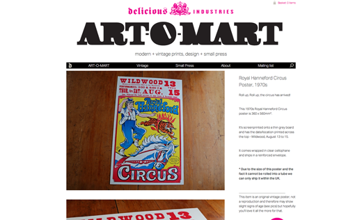
Our good friends Delicious Industries have just moved into their shiny new website. If you're into type and vintage design, you probably already read the Delicious blog - this has now been combined into the main studio website, as has their fantastic print and vintage design shop Art-O-Mart (great name) where you can buy all sorts of interesting print and design niceness. The site is extremely clean and slick, give it a proper look here.
Labels:
Design,
Friends of Sell Sell,
Print,
Stuff to Buy,
Type,
Web
Wednesday, 31 July 2013
Post Of The Day: The Importance Of Being Angry
[I'm writing this on the blogger phone app, so lets see how this goes...] It's been a source of amusement to us that over recent years, it has been depicted that a culture of happy-clappy optimism is the best environment in which creativity and good thinking can best flourish.
Many agencies project this view, yet to us that's always been wrong-headed. No-one ever changed anything by thinking everything's groovy. In fact, it is dissatisfaction and anger with the status quo that create the necessary energy to do things that are fresh, interesting and that change things.
Friday, 12 July 2013
Our New Bullshit Free Zone Posters Are Now Available at STARTUP VITAMINS
Since we made our original Bullshit Free Zone (hyphen deliberately omitted) posters back in May 2009, we have probably sent out about five or six hundred to people fighting the good fight against the rampant encroaching army of bull. Whilst our supply ran out some time ago, we still get many emails from people asking for them. So to meet the ever-present demand, and to keep things interesting, we have teamed up with those fine folks at STARTUP VITAMINS to produce a new and improved BFZ poster.
It's now in four different colour schemes, each in two different sizes, and you can buy it ready-framed for those more formal bullshit free zones in your life. We have some samples here in Sell! Towers and they are stonking – beautifully printed on very good quality, thick paper. Rest assured, get one of these in your life, and no one will be in any doubt of your approach to jargon and waffle.
So why not pop over to the website and get yourself one - here - even better buy one of each and put one in every room.
A huge thanks to Julia and the team at STARTUP VITAMINS.
Subscribe to:
Posts (Atom)